When averages look fine, how can we discover that one customer who’s having a bad experience?
Aggregated metrics help to view our production systems from a global perspective. This is fine when we’re trying to alert on situations that affect a large portion of users - but what if the very few slow requests are all experienced by one single customer?
Here is a story where averages looked good but a specific customer had a poor experience, and how we were able to identify and fix thanks to high-cardinality observability with Honeycomb.
Exploring production weirdness
Production systems are weird and full of emergent behaviours that will never show on staging environments - don’t get me wrong, pre-prod testing is a good thing, but it’s a futile effort to attempt having this cover all cases. This is why I care about running production systems that are observable and explorable.
By definition, emergent behaviours (or unknown-unknowns) are situations that we didn’t think about when building/designing/testing. These behaviours will manifest themselves when we expect them the least, most likely during an incident. A way we can identify these earlier is by being curious about our systems. One thing I love is to take a couple of hours every week to explore real-time production observability data, see what looks odd and keep digging to find where that takes me! Many times, this has led to the discovery of performance outliers that were not bad enough to be incidents but still affected user experience as well as our ability to scale efficiently.
Here’s a recent example of what came out from these exploration exercises.
Average looks fine, but something isn’t right
When exploring the trends on our most used APIs, I started drilling into the response time of a specific endpoint. The average looked higher than other endpoints but it seemed justified by the work done by the backend during these calls.

The latency distribution showed a different picture, clearly split in two distinct bands: a lot of fast requests and a cluster of many requests in the 2-4 seconds latency range:

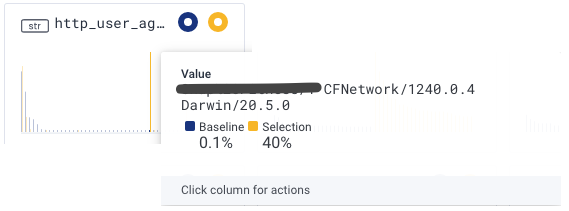
Using Honeycomb BubbleUp, let’s find out how the requests in that upper band differ from the rest. The cool thing is there’s no need to know in advance what characteristics to focus on, BubbleUp will compare the highlighted band with all the other requests and flag what looks different:

In this case, a large portion of that band is coming from a single user-agent, which happens to be a mobile application of a specific customer:

Looking at the latency distribution for that user-agent only, it’s pretty clear this app is having a consistently slower experience (the lower band is almost completely gone):

Before and after the fix
It turns out that this customer had slightly different data which caused many round trips to the database, and further profiling showed these were unnecessary.
Here is what the latency distribution look like after the fix went live (markers show the deployment events):

Now that’s the kind of graph I like!
The value of instrumenting with high-cardinality data
In this particular scenario, it took only a few seconds to identify the unique characteristic of that cluster of slow requests. It was possible because the data the service sent to Honeycomb provided enough context to diffentiate requests from each other. This context is unfortunately what is lost when we only look at aggregated metrics - hence why it is important to work with raw events as the primitive of an observability solution, and to include all the relevant high-cardinality information (such as UserID, Commit number, etc.)